A pixel/voxel-inspired Flutter UI kit that brings the Ore UI aesthetic to your apps (unofficial, not affiliated).
- Unified Ore theme system with light/dark support
- Pixel-style visuals: crisp edges, bold borders, bevel highlights, and shadows
- Built-in fonts and pixel icon assets
- Ready-to-use widgets with consistent styling and ergonomics
Add the dependency to your pubspec.yaml:
dependencies:
oreui_flutter: ^0.0.2import 'package:flutter/material.dart';
import 'package:oreui_flutter/oreui_flutter.dart';
void main() {
runApp(
OreThemeBuilder(
controller: OreThemeController(),
builder: (context, data, brightness) {
return MaterialApp(
debugShowCheckedModeBanner: false,
theme: ThemeData(
brightness: brightness,
extensions: [data],
),
home: const ExamplePage(),
);
},
),
);
}
class ExamplePage extends StatelessWidget {
const ExamplePage({super.key});
@override
Widget build(BuildContext context) {
final ore = OreTheme.of(context);
return Scaffold(
backgroundColor: ore.colors.background,
body: Center(
child: OreButton(
label: 'Start',
onPressed: () {},
),
),
);
}
}Use OreTheme.of(context) to access colors and typography:
final base = OreThemeData.fromBrightness(brightness);
final data = base.copyWith(
colors: base.colors.copyWith(
accent: const Color(0xFF4CAF50),
),
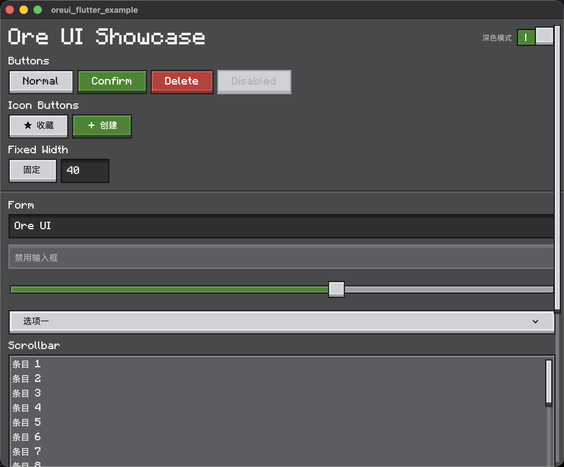
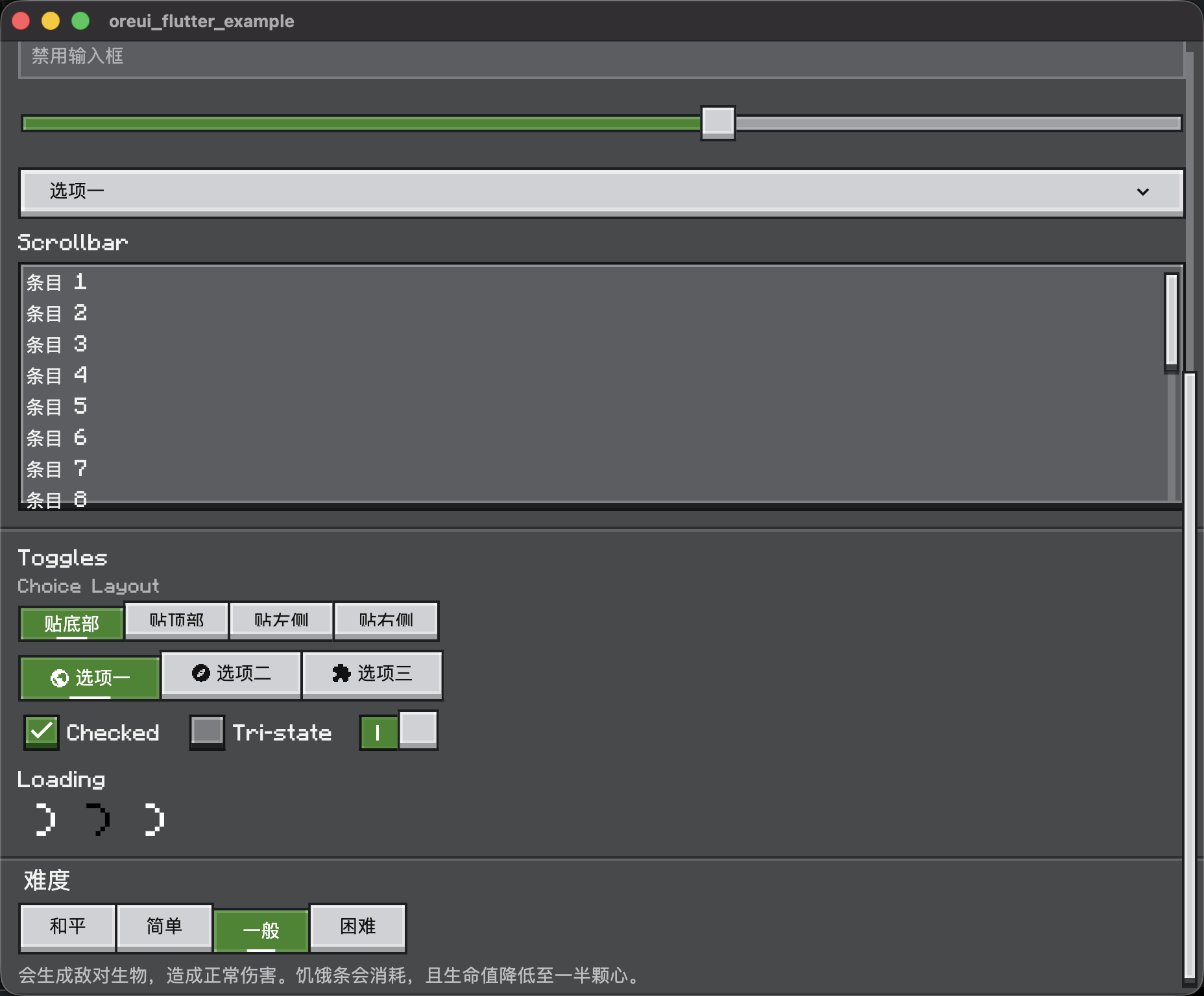
);OreButtonOreCardOreCheckboxOreChoiceButtonsOreChoiceDescriptionOreChoiceTitleOreDividerOreDropdownButtonOreLoadingIndicatorOrePixelIconOreScrollbarOreSliderOreStripOreSurfaceOreSwitchOreThemeModeSwitchOreTextField
Run the demo in example/:
cd example
flutter run
Entry widget: OreShowcaseApp.
- Ore UI is (c) Mojang Studios (Sweden).
- Official repository: https://github.com/Mojang/ore-ui
- Reference repository: https://github.com/Spectrollay/OreUI
像素/方块风格的 Flutter 组件库,提供 Ore UI 主题与基础控件(非官方关联)。
- 统一的 Ore 主题系统,支持明暗模式切换
- 像素化视觉语言:硬边、描边、立体高光与阴影
- 内置字体与像素图标资源
- 组件化封装,方便直接使用或二次扩展
在 pubspec.yaml 添加依赖:
dependencies:
oreui_flutter: ^0.0.2参考上方英文示例即可。
cd example
flutter run入口组件:OreShowcaseApp。
- Ore UI 版权归瑞典 Mojang Studios 所有。
- 官方仓库:https://github.com/Mojang/ore-ui
- 参考仓库:https://github.com/Spectrollay/OreUI