feat: improve Input and Field components with dynamic sizing#234
feat: improve Input and Field components with dynamic sizing#234leahwangcloudflare wants to merge 3 commits intocloudflare:mainfrom
Conversation
 leahwangcloudflare
commented
leahwangcloudflare
commented
Mar 16, 2026
leahwangcloudflare
commented
- Add size prop to Field component (xs, sm, base, lg)
- Dynamic gap spacing: lg uses gap-2, others use gap-1
- Dynamic label text size: xs=text-xs, sm=text-sm, base/lg=text-base
- Restructure label layout to show Optional text on right side
- Input passes size prop to Field for consistent sizing
- Update base input gap from gap-1.5 to gap-1
- Add size prop to Field component (xs, sm, base, lg) - Dynamic gap spacing: lg uses gap-2, others use gap-1 - Dynamic label text size: xs=text-xs, sm=text-sm, base/lg=text-base - Restructure label layout to show Optional text on right side - Input passes size prop to Field for consistent sizing - Update base input gap from gap-1.5 to gap-1
commit: |
Docs PreviewCommit: |
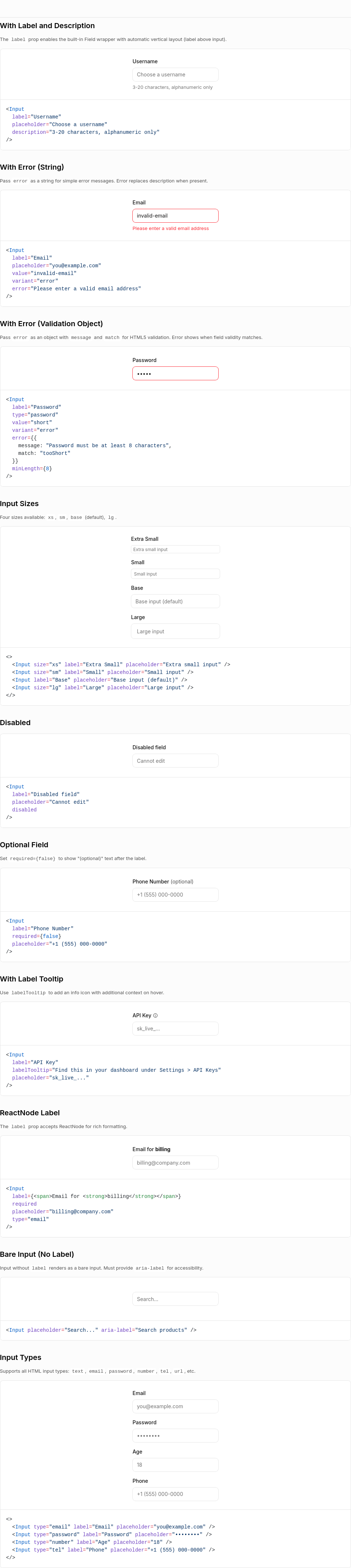
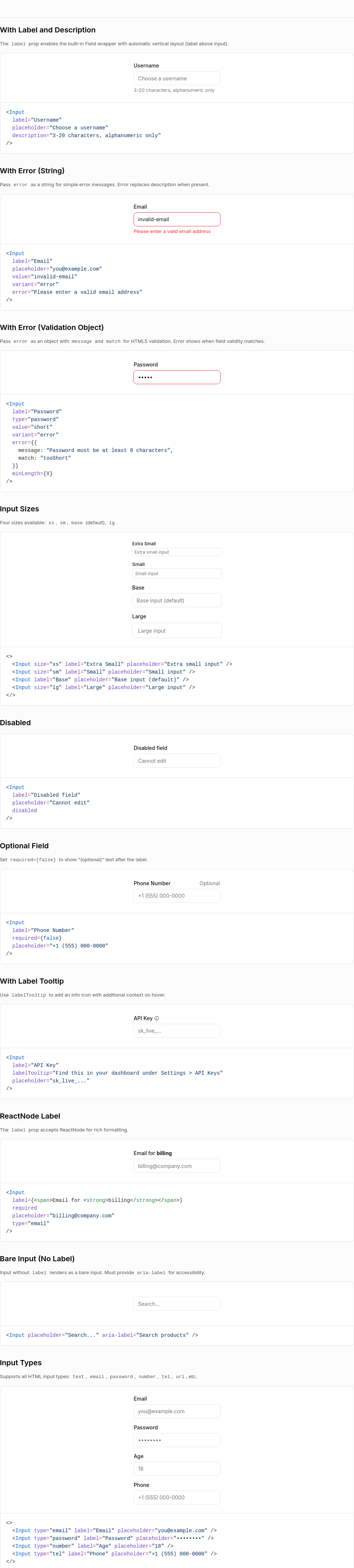
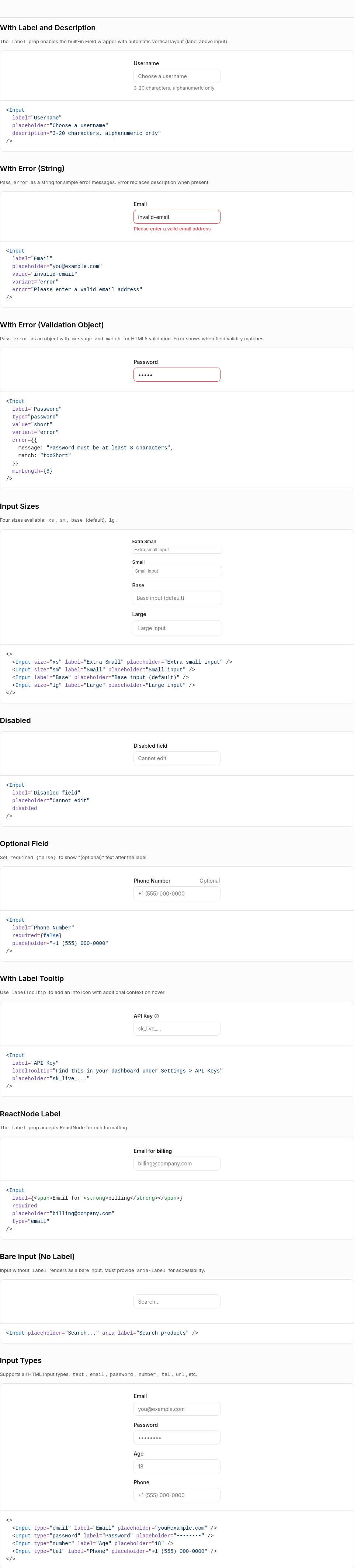
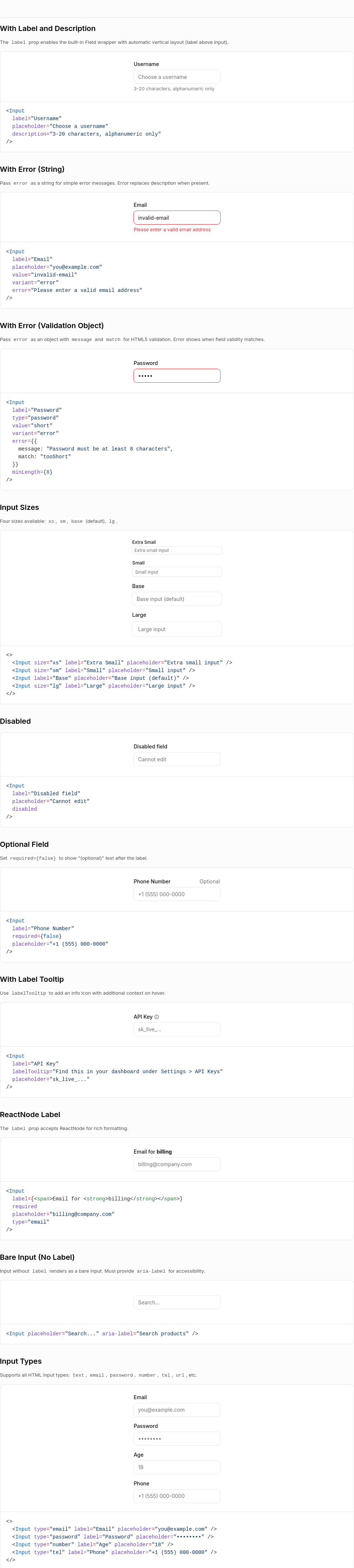
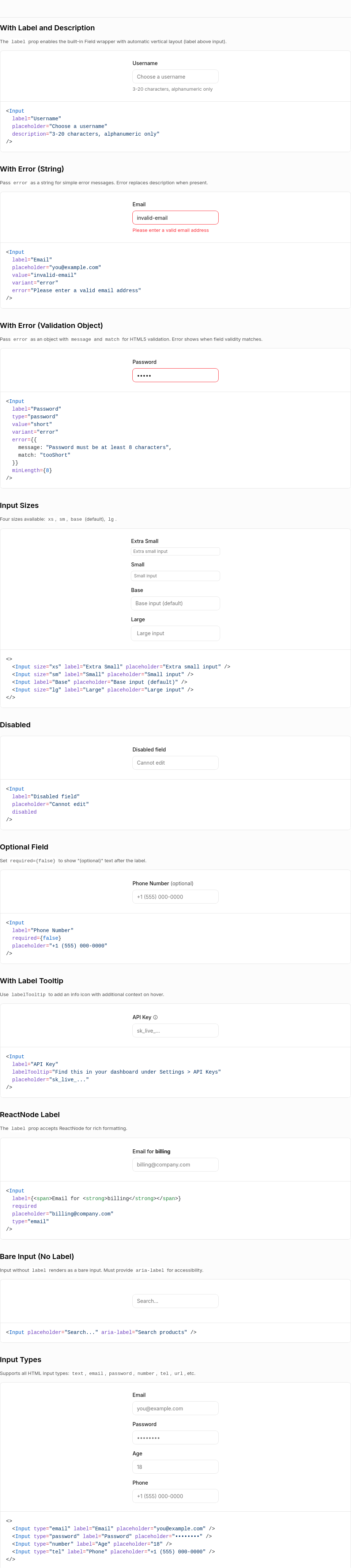
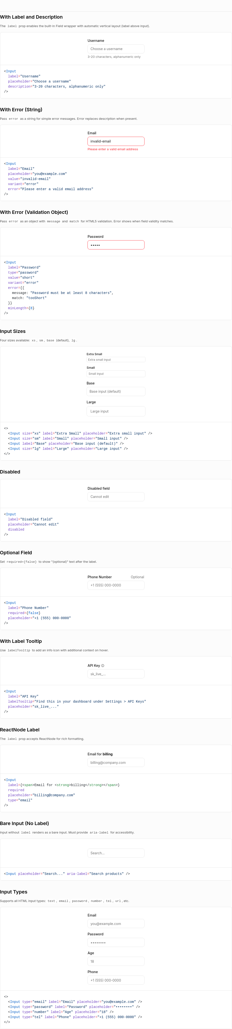
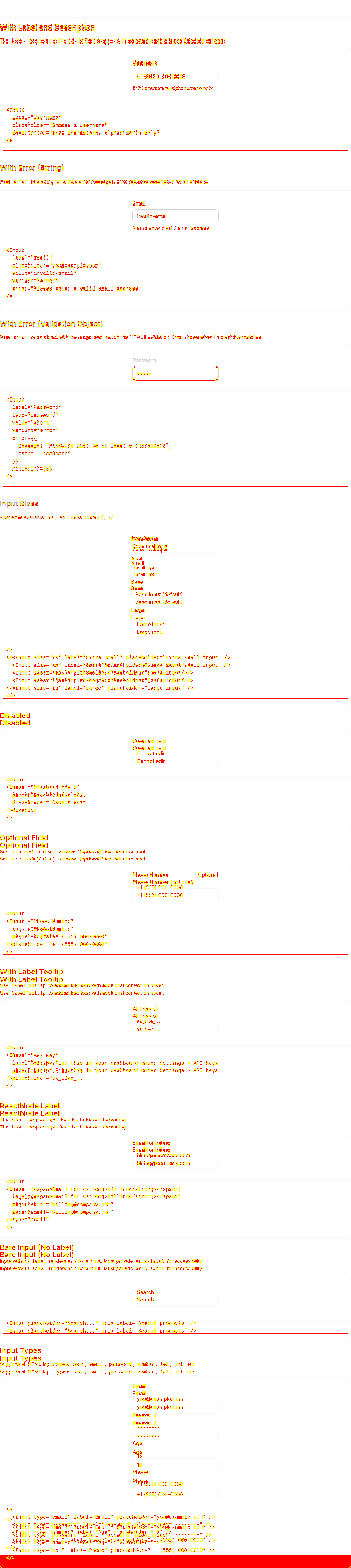
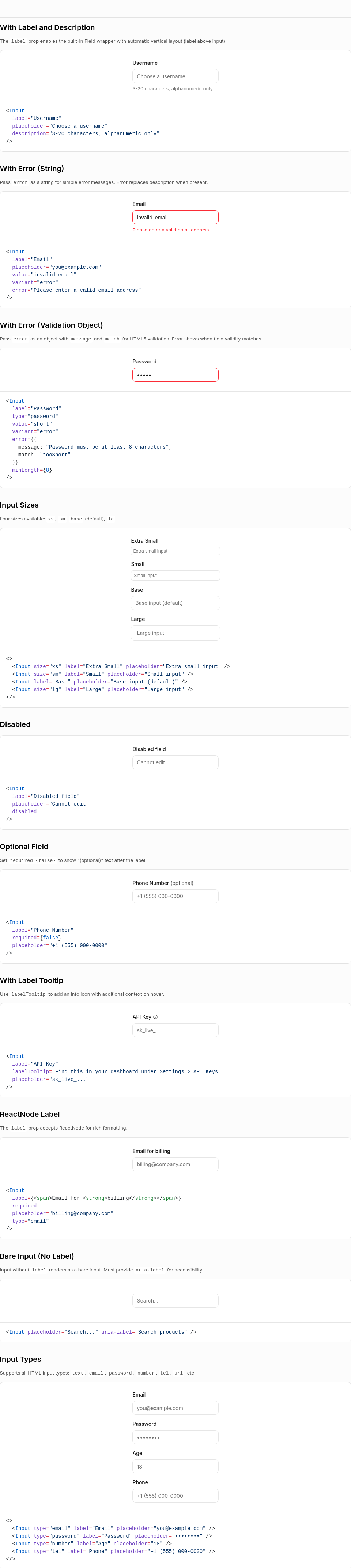
Visual Regression Report10 screenshot(s) with visual changes: Input / With Label and Description110,316 px (2.68%) changed
Input / With Error (String)109,733 px (2.67%) changed
Input / With Error (Validation Object)103,676 px (2.52%) changed
Input / Input Sizes109,990 px (2.67%) changed
Input / Disabled115,081 px (2.8%) changed
Input / Optional Field112,293 px (2.73%) changed
Input / With Label Tooltip112,293 px (2.73%) changed
Input / ReactNode Label112,293 px (2.73%) changed
Input / Bare Input (No Label)106,914 px (2.6%) changed
Input / Input Types113,812 px (2.76%) changed
Generated by Kumo Visual Regression |


 mattrothenberg
left a comment
mattrothenberg
left a comment
mattrothenberg
left a comment
There was a problem hiding this comment.
Thanks for the PR, Leah! The dynamic sizing feature is a solid improvement — having the Field automatically match the Input size makes the API much more intuitive.
A few suggestions:
Gap sizing (field.tsx:31-32)
Instead of the ternary chain, an object lookup is clearer and easier to extend if more sizes are added later:
const gapBySize = {
  xs: "gap-1",
  sm: "gap-1",
  base: "gap-1",
  lg: "gap-2",
} as const;

const gapClass = gapBySize[size];
"Optional" text sizing (field.tsx:152)
The label text scales with size (text-xs, text-sm, text-base), but "Optional" is always text-sm. When size="xs", the label will be smaller than "Optional" which might look a bit off. Could use the same labelTextSize variable here for consistency.
Layout change for "(optional)"
Just flagging — this moves "(optional)" from inline (right after the label text) to right-aligned. That's a visual change for existing consumers. Totally fine if that's the intended design direction, just wanted to confirm it's intentional!
CodeBlock examples cleared
The CodeBlock examples array got emptied in the registry JSON — was that intentional or maybe an artifact from codegen?
Overall this is in good shape!
|
A few more small things I noticed: Empty string in Label (field.tsx around line 147-150) <Label tooltip={labelTooltip} asContent>
{""}
</Label>This works but is a bit unusual — you're passing an empty string just to get the tooltip icon. Consider inlining the tooltip directly: {labelTooltip && (
<Tooltip content={labelTooltip} asChild>
<Button
variant="ghost"
size="xs"
shape="square"
aria-label="More information"
>
<Info className="size-4" />
</Button>
</Tooltip>
)}Input gap change (input.tsx line 22) Just curious — what motivated the change from Bonus: Meter example fix Nice catch fixing |
- Refactor gap spacing to use object lookup instead of ternary chain
- Make Optional text scale with input size for consistency
- Replace Label component with direct Tooltip implementation to avoid empty string children
- Update base input gap from gap-1 to gap-1.5 for better spacing
|
@mattrothenberg hey Matt, thank you so much for taking a look! I've made the changes based on your suggestions. In terms of the input gap change: Initially I changed base to gap-1 to match conventional spacing (4px or 8px instead of 6px) In terms of the Optional text |
|
CodeBlock examples cleared: It was from codegen.. Should I avoid including it in the commit next time? |
2 participants