fix(buttons): add focus states on all buttons#248
fix(buttons): add focus states on all buttons#248mattrothenberg merged 4 commits intocloudflare:mainfrom
Conversation
commit: |
Docs PreviewCommit: |
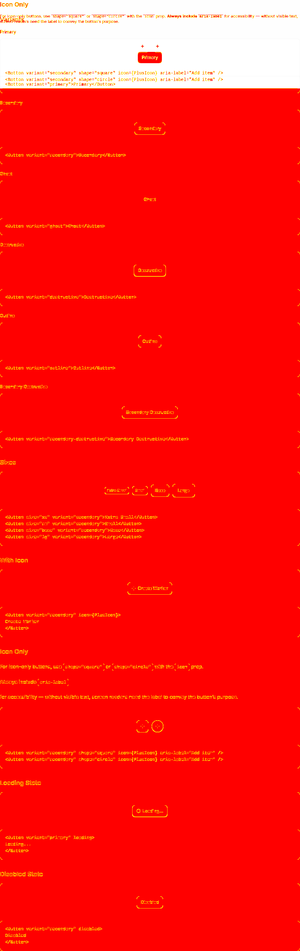
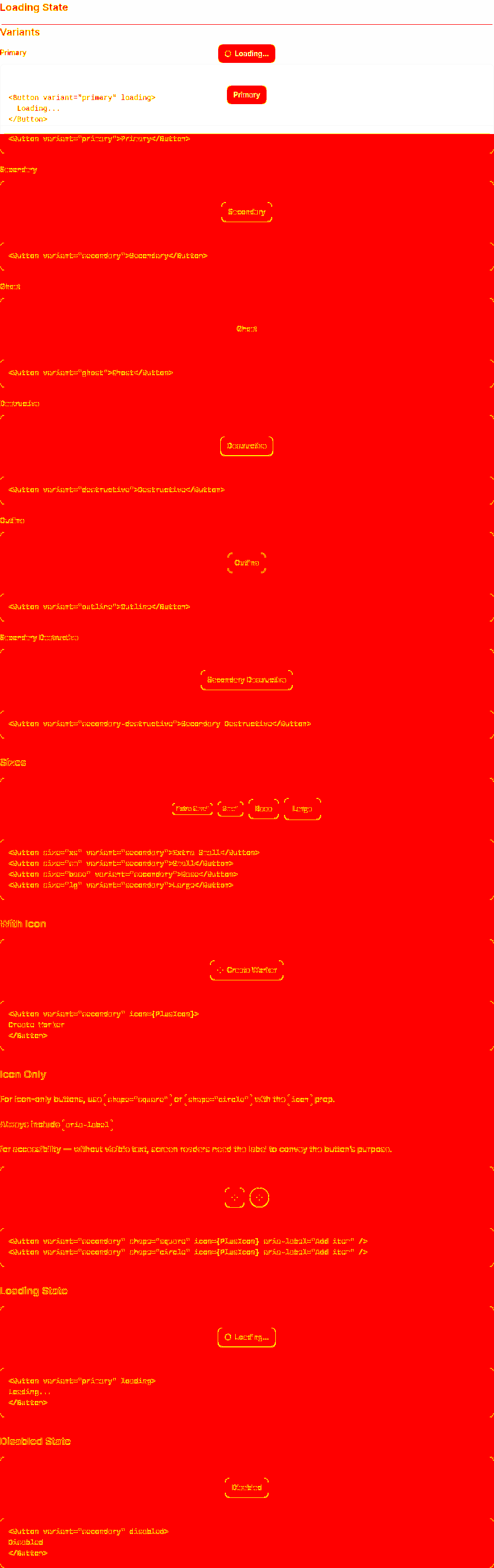
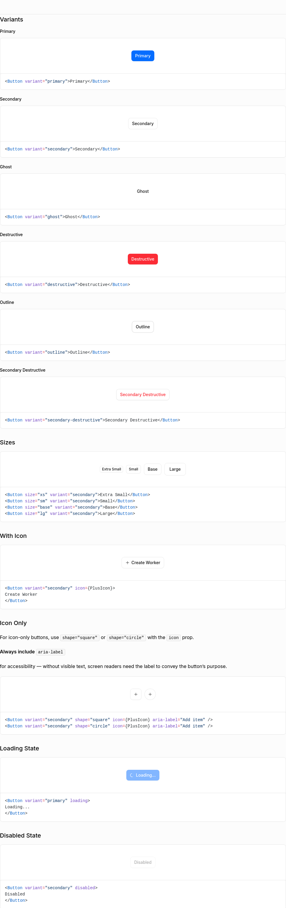
Visual Regression Report29 screenshot(s) with visual changes: Button / Variants1,536,680 px (52.64%) changed
Button / Sizes2,622,880 px (89.81%) changed
Button / With Icon2,639,694 px (90.39%) changed
Button / Icon Only2,621,796 px (89.78%) changed
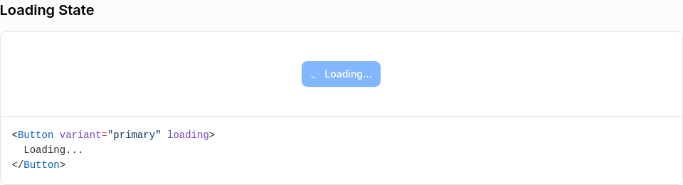
Button / Loading State2,643,014 px (90.5%) changed
Button / Disabled State2,639,702 px (90.39%) changed
Combobox (Open)751,571 px (5.23%) changed
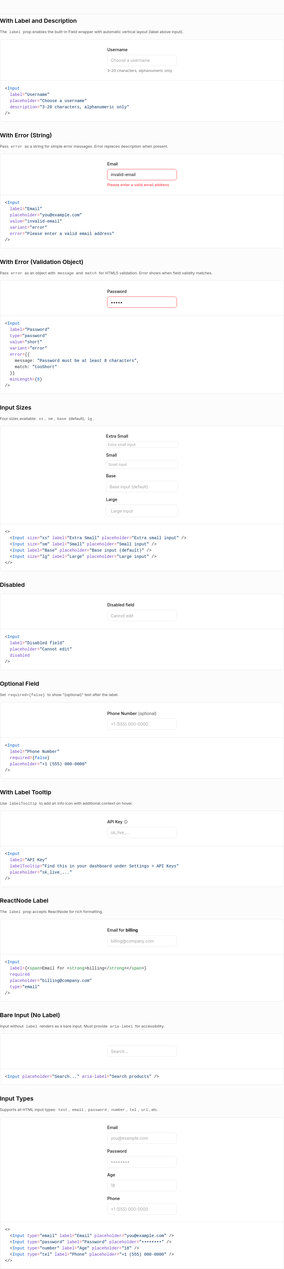
Input / With Label and Description409,377 px (9.21%) changed
Input / With Error (String)408,885 px (9.2%) changed
Input / With Error (Validation Object)407,778 px (9.18%) changed
Input / Input Sizes409,145 px (9.21%) changed
Input / Disabled408,463 px (9.19%) changed
Input / Optional Field407,778 px (9.18%) changed
Input / With Label Tooltip409,125 px (9.21%) changed
Input / ReactNode Label406,664 px (9.15%) changed
Input / Bare Input (No Label)409,393 px (9.21%) changed
Input / Input Types407,710 px (9.17%) changed
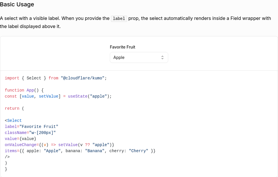
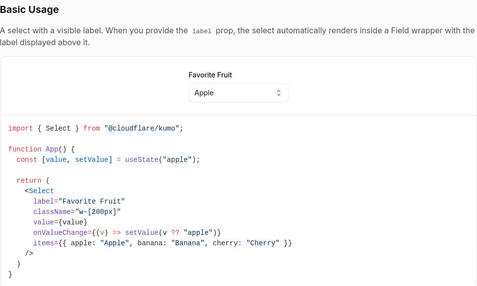
Select / Basic Usage48,394 px (8.22%) changed
Select / Without Visible Label44,119 px (7.84%) changed
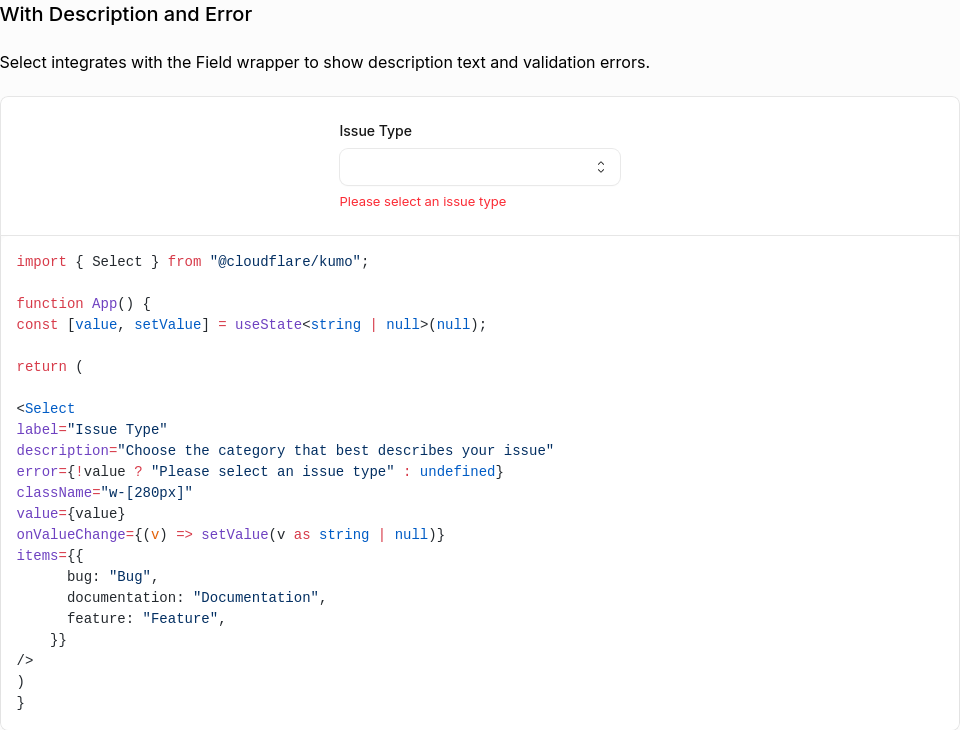
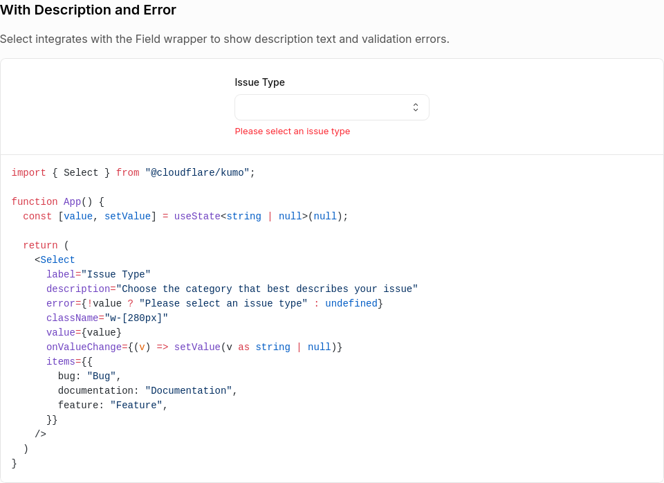
Select / With Description and Error45,413 px (6.48%) changed
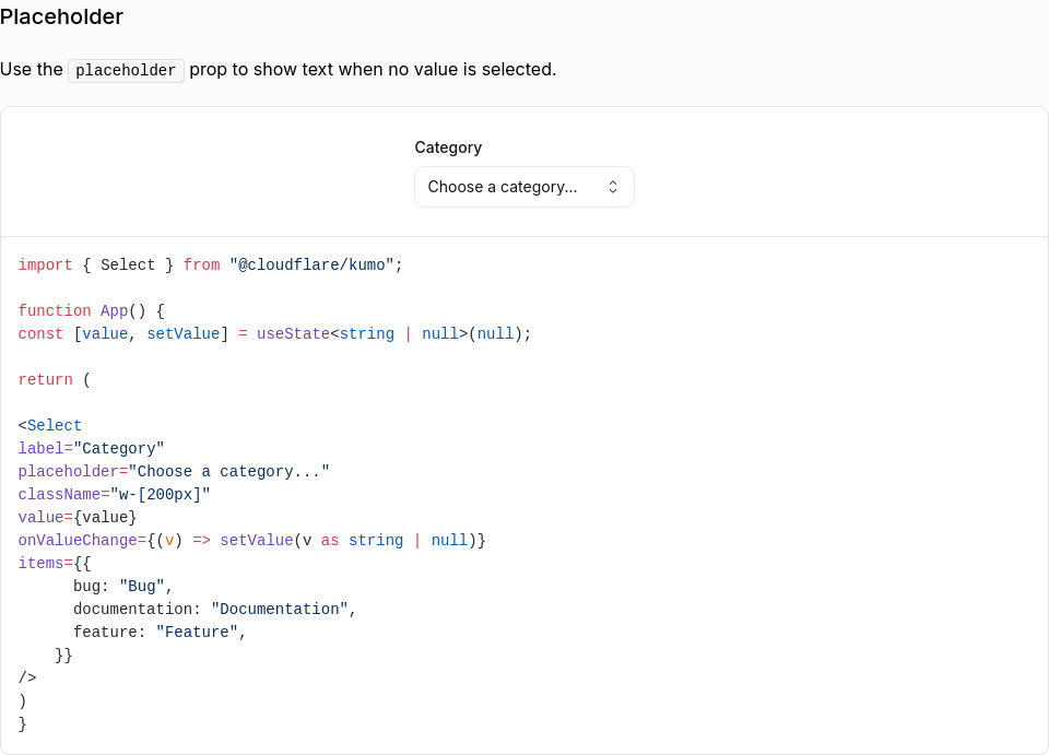
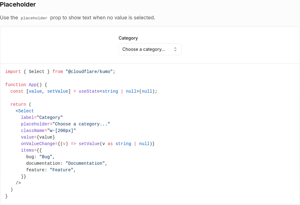
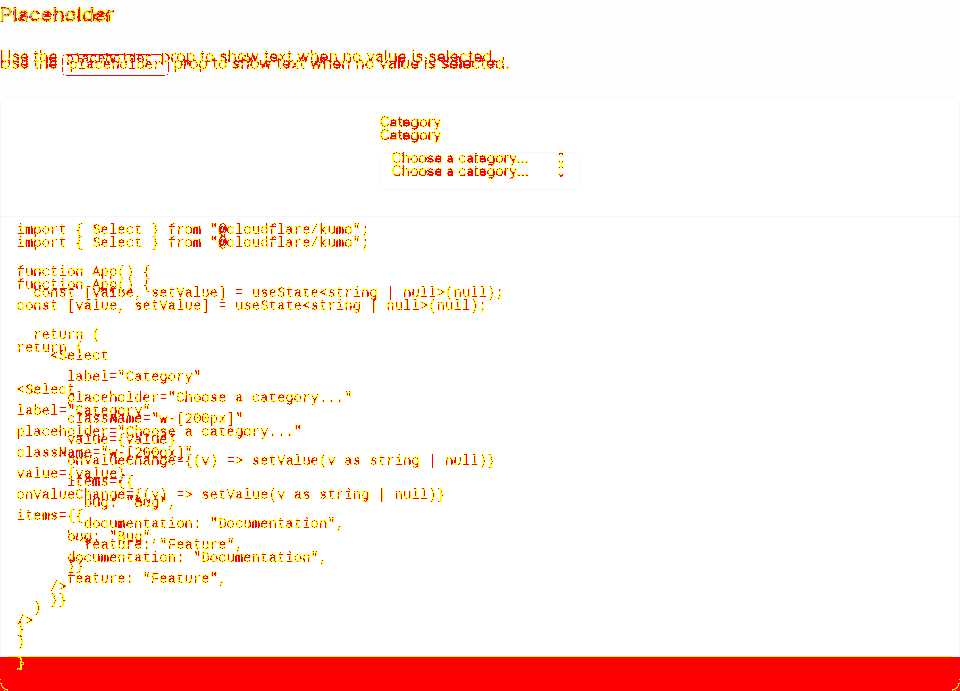
Select / Placeholder44,460 px (6.7%) changed
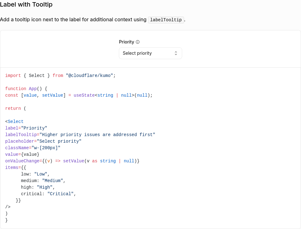
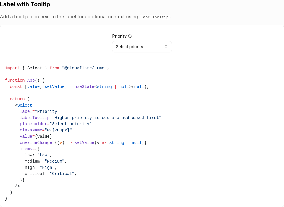
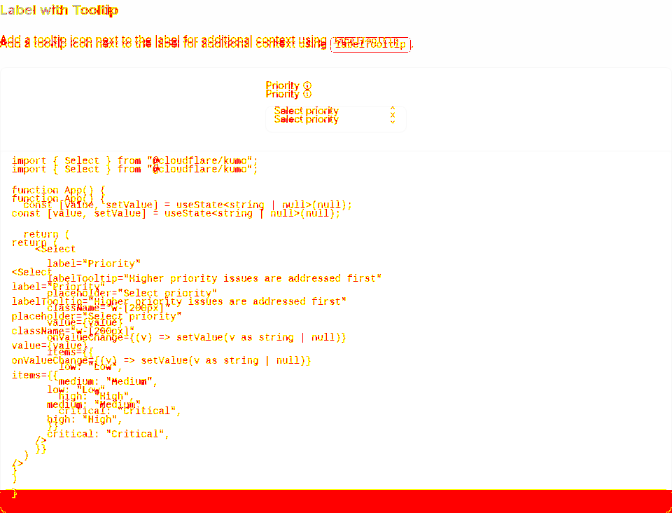
Select / Label with Tooltip44,315 px (6.31%) changed
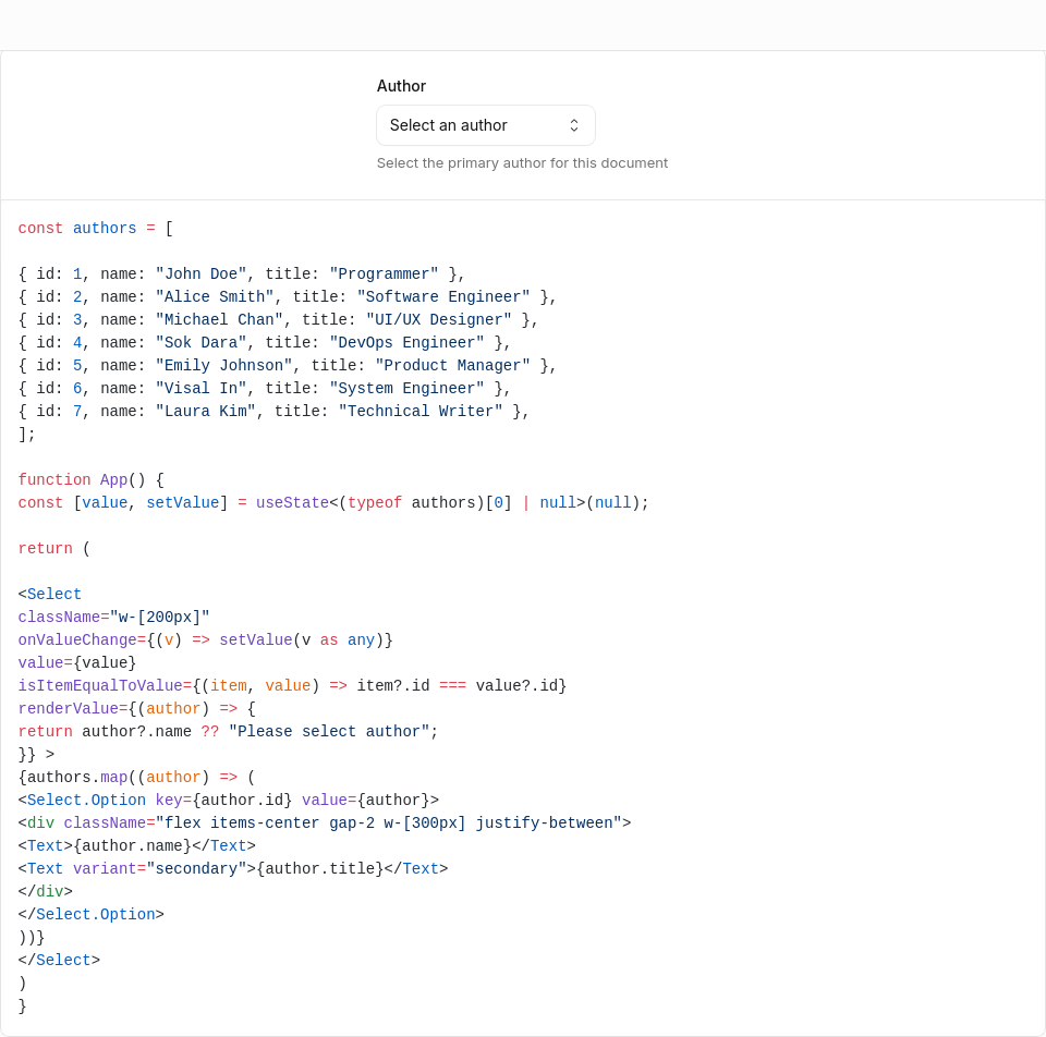
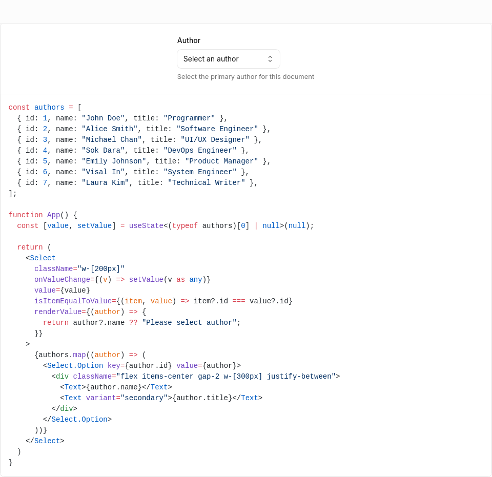
Select / Custom Rendering119,129 px (7.17%) changed
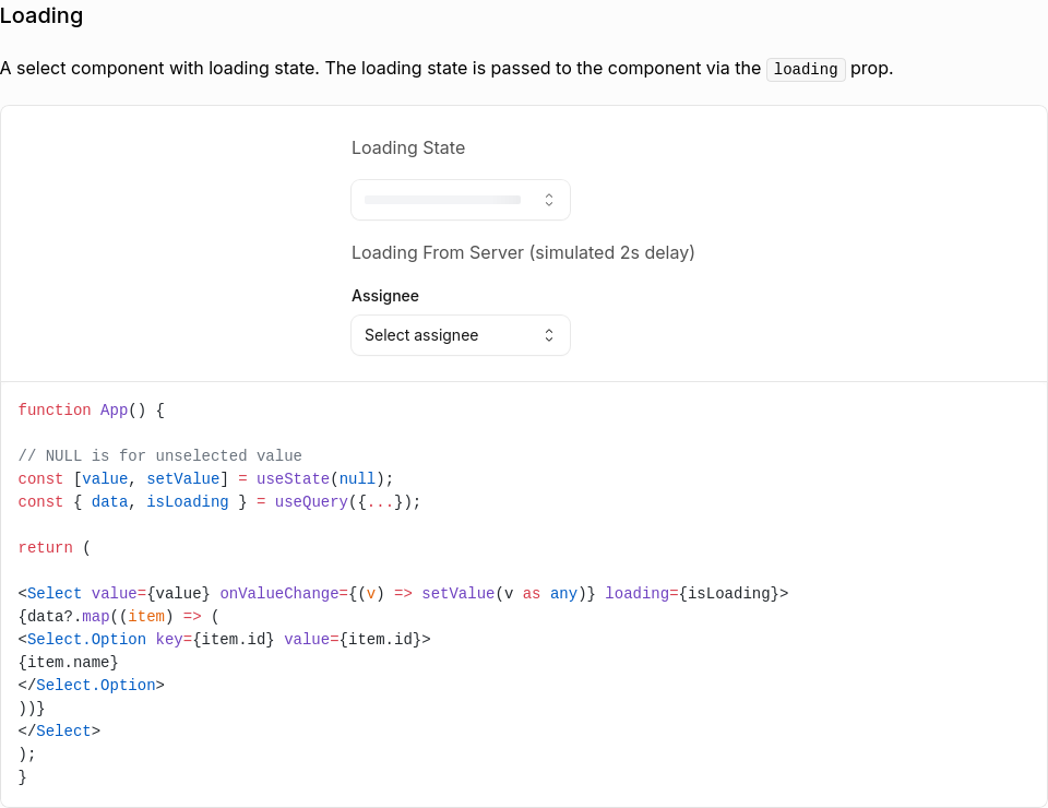
Select / Loading73,625 px (10.36%) changed
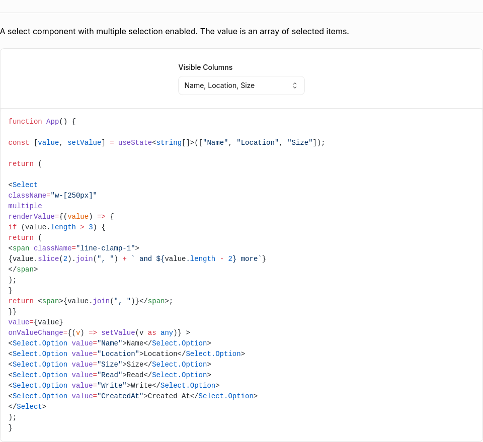
Select / Multiple Item800,033 px (48.68%) changed
Select / More Example40,100 px (4.39%) changed
Select / Select18,738 px (2.18%) changed
Select / Select.Option18,738 px (2.18%) changed
Select (Open)2,457,268 px (15.61%) changed
Generated by Kumo Visual Regression |


There was a problem hiding this comment.
Thanks for catching this a11y issue! The fix works great for Button - I tested locally and can see the focus ring now.
While testing, I noticed the same outline-none pattern exists in a few other input components that would benefit from the same treatment while we're in here:
input.tsx(line 111)select.tsx(lines 62, 160)sensitive-input.tsx(lines 333, 396)combobox.tsx(lines 478, 502)
- Remove outline-none from inputVariants()
- Remove outline-none from selectVariants() and Select trigger
- Remove outline-none from Combobox inputs
- Remove outline-none from SensitiveInput, add focus ring to eye button
|
Hey! I went ahead and pushed a commit extending the fix to the other components that had the same
|
Extends the focus state fix to Combobox by removing outline-none from
the positioner, allowing the browser's default focus ring to show.
2 participants
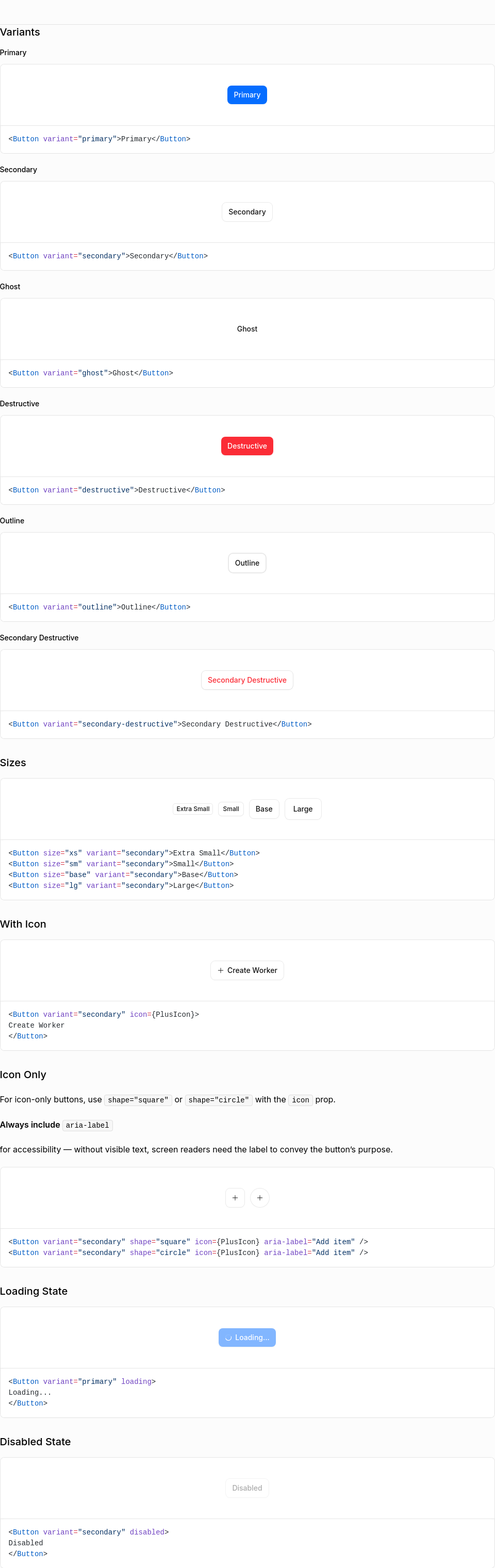
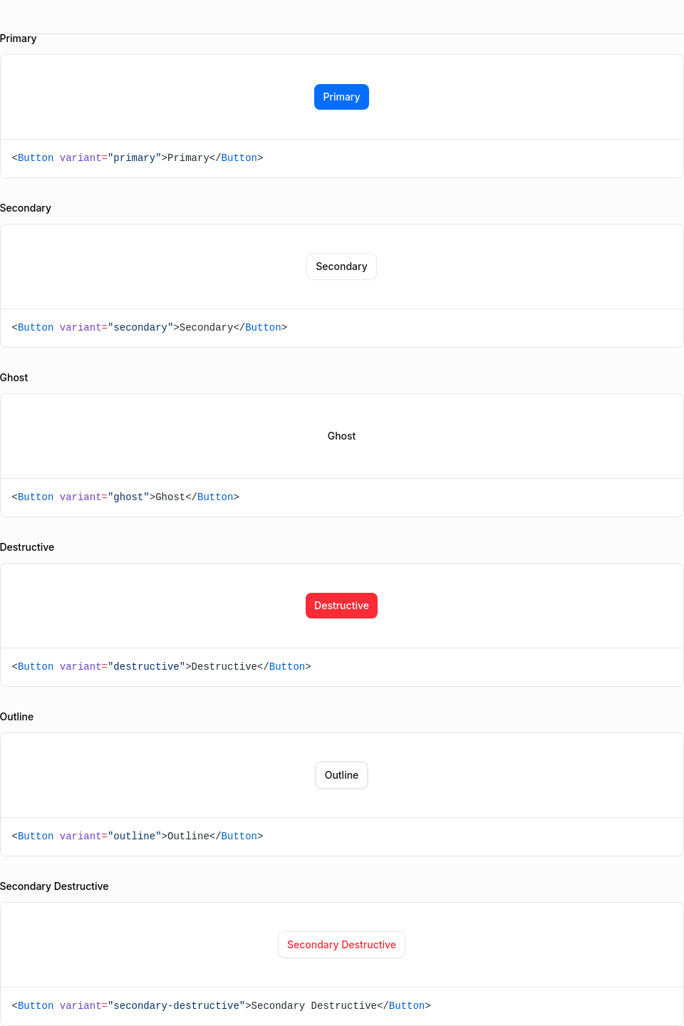
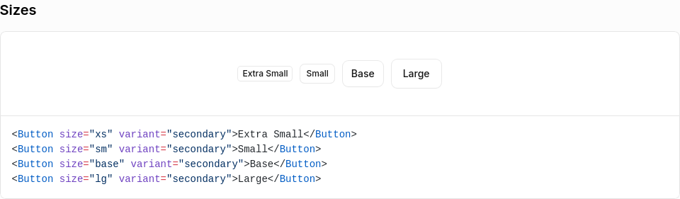
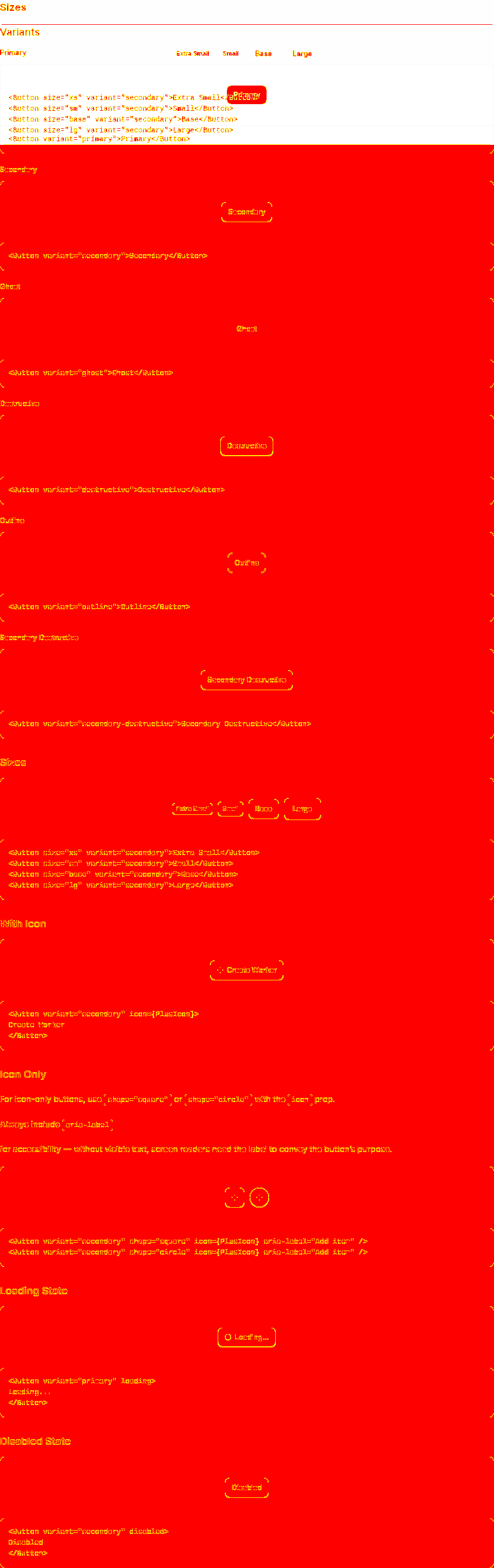
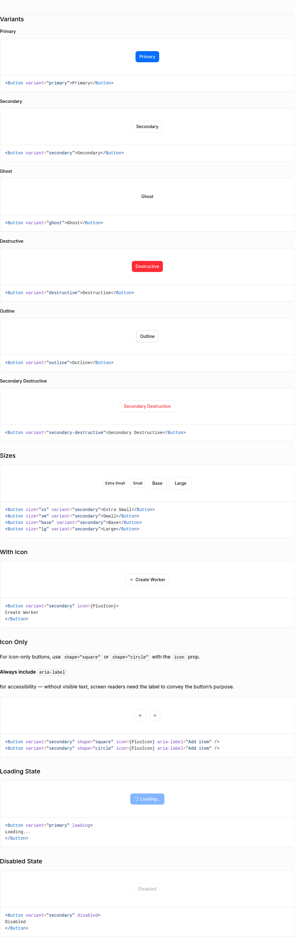
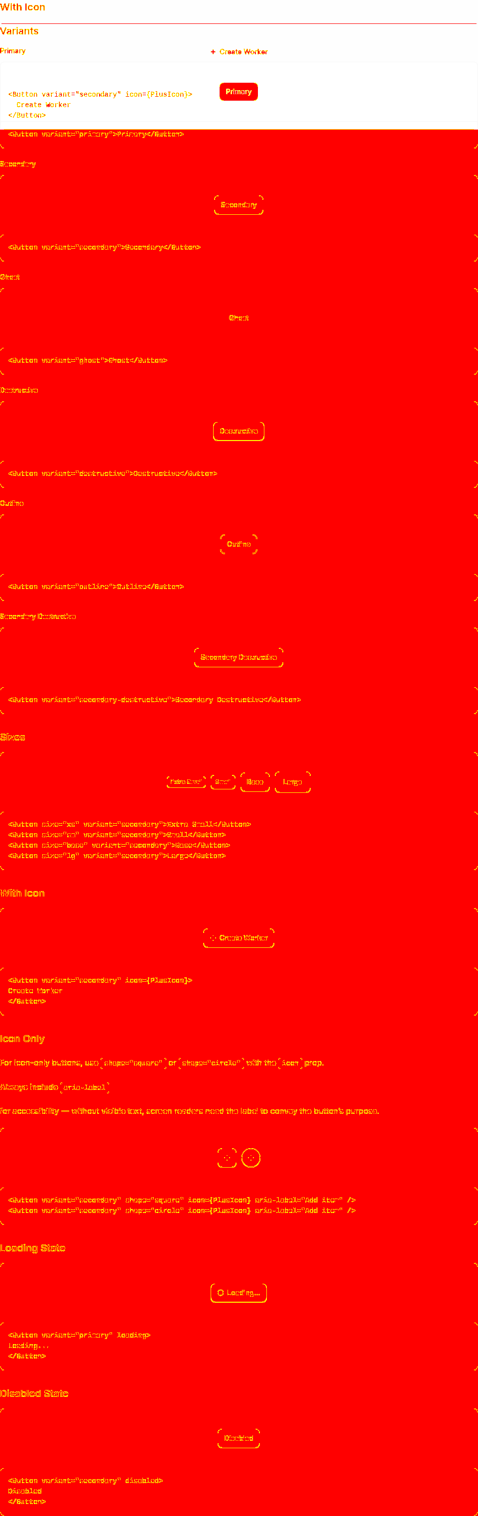
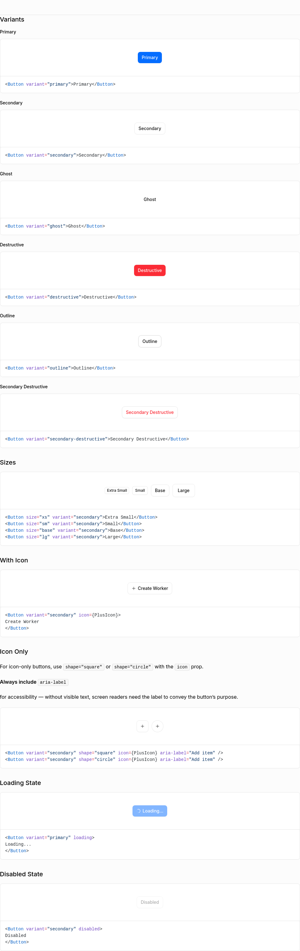
problem
focus state was missing in all buttons which didn't meet a11y guidelines on ensuring focus indicators are easy to spot during keyboard interactions.
what changed
removed
outline-noneto ensure focus states are visible for all button variants.