forked from material-components/material-web
-
Notifications
You must be signed in to change notification settings - Fork 1
feat: move topappbar component #16
New issue
Have a question about this project? Sign up for a free GitHub account to open an issue and contact its maintainers and the community.
By clicking “Sign up for GitHub”, you agree to our terms of service and privacy statement. We’ll occasionally send you account related emails.
Already on GitHub? Sign in to your account
Open
zZHorizonZz
wants to merge
1
commit into
main-community
Choose a base branch
from
top-app-bar
base: main-community
Could not load branches
Branch not found: {{ refName }}
Loading
Could not load tags
Nothing to show
Loading
Are you sure you want to change the base?
Some commits from the old base branch may be removed from the timeline,
and old review comments may become outdated.
Open
Changes from all commits
Commits
File filter
Filter by extension
Conversations
Failed to load comments.
Loading
Jump to
Jump to file
Failed to load files.
Loading
Diff view
Diff view
There are no files selected for viewing
This file contains hidden or bidirectional Unicode text that may be interpreted or compiled differently than what appears below. To review, open the file in an editor that reveals hidden Unicode characters.
Learn more about bidirectional Unicode characters
Loading
Sorry, something went wrong. Reload?
Sorry, we cannot display this file.
Sorry, this file is invalid so it cannot be displayed.
This file contains hidden or bidirectional Unicode text that may be interpreted or compiled differently than what appears below. To review, open the file in an editor that reveals hidden Unicode characters.
Learn more about bidirectional Unicode characters
| Original file line number | Diff line number | Diff line change |
|---|---|---|
| @@ -0,0 +1,385 @@ | ||
| <!-- catalog-only-start --><!-- --- | ||
| name: Top App Bar | ||
| dirname: topappbar | ||
| -----><!-- catalog-only-end --> | ||
|
|
||
| <catalog-component-header> | ||
| <catalog-component-header-title slot="title"> | ||
|
|
||
| # Top App Bar | ||
|
|
||
| <!-- no-catalog-start --> | ||
|
|
||
| <!--* | ||
| # Document freshness: For more information, see go/fresh-source. | ||
| freshness: { owner: 'maicol07' reviewed: '2025-04-27' } | ||
| tag: 'docType:reference' | ||
| *--> | ||
|
|
||
| <!-- go/md-button --> | ||
|
|
||
| <!-- [TOC] --> | ||
|
|
||
| <!-- external-only-start --> | ||
| **This documentation is fully rendered on the | ||
| [Material Web Additions catalog](https://material-web-additions.maicol07.it/components/top-app-bar/).** | ||
| <!-- external-only-end --> | ||
|
|
||
| <!-- no-catalog-end --> | ||
|
|
||
| [Top app bars](https://m3.material.io/components/top-app-bar) display navigation, actions, and text at the top of a screen. | ||
|
|
||
| </catalog-component-header-title> | ||
|
|
||
| <img | ||
| class="hero" | ||
| alt="A phone showing a saved podcasts screen with a small top app bar with the left arrow leading icon and three trailing icons: attachment, calendar and more." | ||
| src="https://lh3.googleusercontent.com/gET6z1juQKqCuAykihEyJGjGMAQa6rHiwaRHjcIUYGjl4pU37Od1a36TyUBK2GwMMTtSGpZen3Eongv6eBwMi1QC11LzeaXcW-NhC-CrCAU1VsbkyMM=w1200"> | ||
|
|
||
| </catalog-component-header> | ||
|
|
||
| * [Design article](https://m3.material.io/components/top-app-bar) <!-- {.external} --> | ||
| * [API Documentation](#api) | ||
| * [Source code](https://github.com/maicol07/material-web-additions/tree/main/top-app-bar) | ||
| <!-- {.external} --> | ||
|
|
||
| <!-- catalog-only-start --> | ||
|
|
||
| <!-- | ||
|
|
||
| ## Interactive Demo | ||
|
|
||
| {% playgroundexample dirname=dirname %} | ||
|
|
||
| --> | ||
|
|
||
| <!-- catalog-only-end --> | ||
|
|
||
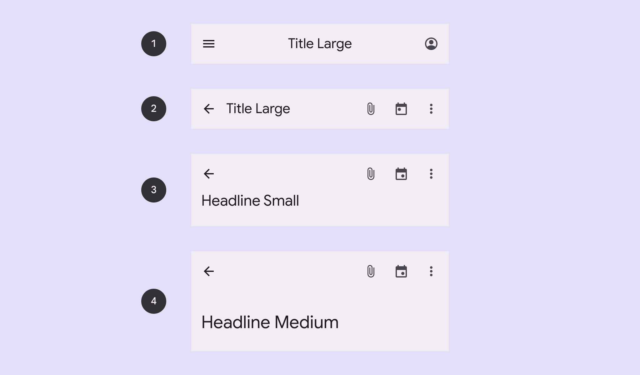
| ## Types | ||
|
|
||
| <!-- no-catalog-start --> | ||
|
|
||
|  | ||
|
|
||
| <!-- no-catalog-end --> | ||
| <!-- catalog-only-start --> | ||
|
|
||
| <!-- | ||
|
|
||
| <div class="figure-wrapper"> | ||
| <figure | ||
| class="types-image" | ||
| style="justify-content:center;" | ||
| title="Center-aligned, small, medium and large top app bar types." | ||
| aria-label="The 4 types of top app bars"> | ||
| <style> | ||
| .types-image .wrapper, | ||
| .types-image .wrapper > * { | ||
| display: flex; | ||
| padding: 8px; | ||
| flex-wrap: wrap; | ||
| justify-content: center; | ||
| } | ||
| .types-image .wrapper > * { | ||
| flex-direction: row; | ||
| align-items: center; | ||
| padding-inline: 16px; | ||
| } | ||
| .types-image span { | ||
| display: inline-flex; | ||
| background-color: var(--md-sys-color-inverse-surface); | ||
| color: var(--md-sys-color-inverse-on-surface); | ||
| padding: 8px; | ||
| margin-block-start: 8px; | ||
| width: 24px; | ||
| height: 24px; | ||
| border-radius: 50%; | ||
| justify-content: center; | ||
| align-items: center; | ||
| } | ||
| </style> | ||
| <div class="wrapper"> | ||
| <div> | ||
| <md-center-aligned-top-app-bar> | ||
| <md-icon-button slot="start"><md-icon>menu</md-icon></md-icon-button> | ||
| <div>Title Large</div> | ||
| <md-icon-button slot="end"><md-icon>account_circle</md-icon></md-icon-button> | ||
| </md-center-aligned-top-app-bar> | ||
| <span>1</span> | ||
| </div> | ||
| <div> | ||
| <md-small-top-app-bar> | ||
| <md-icon-button slot="start"><md-icon>arrow_back</md-icon></md-icon-button> | ||
| <div>Title Large</div> | ||
| <div slot="end"> | ||
| <md-icon-button><md-icon>attach_file</md-icon></md-icon-button> | ||
| <md-icon-button><md-icon>event</md-icon></md-icon-button> | ||
| <md-icon-button><md-icon>more_vert</md-icon></md-icon-button> | ||
| </div> | ||
| </md-small-top-app-bar> | ||
| <span>2</span> | ||
| </div> | ||
| <div> | ||
| <md-medium-top-app-bar> | ||
| <md-icon-button slot="start"><md-icon>arrow_back</md-icon></md-icon-button> | ||
| <div>Headline Small</div> | ||
| <div slot="end"> | ||
| <md-icon-button><md-icon>attach_file</md-icon></md-icon-button> | ||
| <md-icon-button><md-icon>event</md-icon></md-icon-button> | ||
| <md-icon-button><md-icon>more_vert</md-icon></md-icon-button> | ||
| </div> | ||
| </md-medium-top-app-bar> | ||
| <span>3</span> | ||
| </div> | ||
| <div> | ||
| <md-large-top-app-bar> | ||
| <md-icon-button slot="start"><md-icon>arrow_back</md-icon></md-icon-button> | ||
| <div>Headline Small</div><div slot="end"> | ||
| <md-icon-button><md-icon>attach_file</md-icon></md-icon-button> | ||
| <md-icon-button><md-icon>event</md-icon></md-icon-button> | ||
| <md-icon-button><md-icon>more_vert</md-icon></md-icon-button> | ||
| </div> | ||
| </md-large-top-app-bar> | ||
| <span>4</span> | ||
| </div> | ||
| </div> | ||
| </figure> | ||
| </div> | ||
|
|
||
| --> | ||
|
|
||
| <!-- catalog-only-end --> | ||
|
|
||
| 1. [Center-aligned](#center-aligned) | ||
| 2. [Small](#small) | ||
| 3. [Medium](#medium) | ||
| 4. [Large](#large) | ||
|
|
||
| ## Usage | ||
|
|
||
| ### Center-aligned | ||
| A center-aligned top app bar is a top app bar with the title centered. | ||
|
|
||
| ```html | ||
| <md-center-aligned-top-app-bar> | ||
| <md-icon-button slot="start"> | ||
| <md-icon>menu</md-icon> | ||
| </md-icon-button> | ||
| <div>Title Large</div> | ||
| <md-icon-button slot="end"> | ||
| <md-icon>account_circle</md-icon> | ||
| </md-icon-button> | ||
| </md-center-aligned-top-app-bar> | ||
| ``` | ||
|
|
||
| ### Small | ||
| A small top app bar is a top app bar with a title and up to 3 trailing icons. | ||
|
|
||
| ```html | ||
| <md-small-top-app-bar> | ||
| <md-icon-button slot="start"> | ||
| <md-icon>arrow_back</md-icon> | ||
| </md-icon-button> | ||
| <div>Title Large</div> | ||
| <div slot="end"> | ||
| <md-icon-button> | ||
| <md-icon>attach_file</md-icon> | ||
| </md-icon-button> | ||
| <md-icon-button> | ||
| <md-icon>event</md-icon> | ||
| </md-icon-button> | ||
| <md-icon-button> | ||
| <md-icon>more_vert</md-icon> | ||
| </md-icon-button> | ||
| </div> | ||
| </md-small-top-app-bar> | ||
| ``` | ||
|
|
||
| ### Medium | ||
| A medium top app bar is a top app bar with a title and up to 3 trailing icons. | ||
|
|
||
| ```html | ||
| <md-medium-top-app-bar> | ||
| <md-icon-button slot="start"> | ||
| <md-icon>arrow_back</md-icon> | ||
| </md-icon-button> | ||
| <div>Headline Small</div> | ||
| <div slot="end"> | ||
| <md-icon-button> | ||
| <md-icon>attach_file</md-icon> | ||
| </md-icon-button> | ||
| <md-icon-button> | ||
| <md-icon>event</md-icon> | ||
| </md-icon-button> | ||
| <md-icon-button> | ||
| <md-icon>more_vert</md-icon> | ||
| </md-icon-button> | ||
| </div> | ||
| </md-medium-top-app-bar> | ||
| ``` | ||
|
|
||
| ### Large | ||
| A large top app bar is a top app bar with an headline and up to 3 trailing icons. | ||
|
|
||
| ```html | ||
| <md-medium-top-app-bar> | ||
| <md-icon-button slot="start"> | ||
| <md-icon>arrow_back</md-icon> | ||
| </md-icon-button> | ||
| <div>Headline Small</div> | ||
| <div slot="end"> | ||
| <md-icon-button> | ||
| <md-icon>attach_file</md-icon> | ||
| </md-icon-button> | ||
| <md-icon-button> | ||
| <md-icon>event</md-icon> | ||
| </md-icon-button> | ||
| <md-icon-button> | ||
| <md-icon>more_vert</md-icon> | ||
| </md-icon-button> | ||
| </div> | ||
| </md-medium-top-app-bar> | ||
| ``` | ||
|
|
||
| ## Theming | ||
|
|
||
| Top app bars supports [Material theming](https://material-web.dev/theming/material-theming/) and can be customized | ||
| in terms of color, typography, and shape. | ||
|
|
||
| ### Tokens | ||
| | Token | Default value | | ||
| |------------------------------------------|------------------------------| | ||
| | `--md-$type-top-app-bar-container-color` | `--md-sys-color-surface` | | ||
| | `--md-$type-top-app-bar-container-shape` | `--md-sys-shape-corner-none` | | ||
|
|
||
| * [All tokens](https://github.com/maicol07/material-web-additions/blob/main/tokens/_md-comp-top-app-bar-small.scss) | ||
| <!-- {.external} --> | ||
|
|
||
| ### Example | ||
|
|
||
| <!-- no-catalog-start --> | ||
|
|
||
|  | ||
|
|
||
| <!-- no-catalog-end --> | ||
| <!-- catalog-only-start --> | ||
|
|
||
| <!-- | ||
|
|
||
| <div class="figure-wrapper"> | ||
| <figure | ||
| style="justify-content:center;align-items:center;" | ||
| class="styled-example" | ||
| title="Top app bar theming example." | ||
| aria-label="A small top app bar with a different theme applied"> | ||
| <style> | ||
| .styled-example { | ||
| --md-small-top-app-bar-container-shape: 8px; | ||
| --md-small-top-app-bar-container-color: red; | ||
| } | ||
| </style> | ||
| <md-small-top-app-bar> | ||
| <md-icon-button slot="start"> | ||
| <md-icon>arrow_back</md-icon> | ||
| </md-icon-button> | ||
| <div>Headline Small</div> | ||
| <div slot="end"> | ||
| <md-icon-button> | ||
| <md-icon>attach_file</md-icon> | ||
| </md-icon-button> | ||
| <md-icon-button> | ||
| <md-icon>event</md-icon> | ||
| </md-icon-button> | ||
| <md-icon-button> | ||
| <md-icon>more_vert</md-icon> | ||
| </md-icon-button> | ||
| </div> | ||
| </md-small-top-app-bar> | ||
| </figure> | ||
| </div> | ||
|
|
||
| --> | ||
|
|
||
| <!-- catalog-only-end --> | ||
|
|
||
| ```html | ||
| <style> | ||
| .styled-example { | ||
| --md-small-top-app-bar-container-shape: 8px; | ||
| --md-small-top-app-bar-container-color: red; | ||
| } | ||
| </style> | ||
|
|
||
| <md-small-top-app-bar class="styled-example"> | ||
| <md-icon-button slot="start"> | ||
| <md-icon>arrow_back</md-icon> | ||
| </md-icon-button> | ||
| <div>Headline Small</div> | ||
| <div slot="end"> | ||
| <md-icon-button> | ||
| <md-icon>attach_file</md-icon> | ||
| </md-icon-button> | ||
| <md-icon-button> | ||
| <md-icon>event</md-icon> | ||
| </md-icon-button> | ||
| <md-icon-button> | ||
| <md-icon>more_vert</md-icon> | ||
| </md-icon-button> | ||
| </div> | ||
| </md-small-top-app-bar> | ||
| ``` | ||
|
|
||
| <!-- auto-generated API docs start --> | ||
|
|
||
| ## API | ||
|
|
||
|
|
||
| ### MdCenterAlignedTopAppBar <code><md-center-aligned-top-app-bar></code> | ||
|
|
||
| #### Properties | ||
|
|
||
| <!-- mdformat off(autogenerated might break rendering in catalog) --> | ||
|
|
||
| Property | Attribute | Type | Default | Description | ||
| --- | --- | --- | --- | --- | ||
| `sticky` | `sticky` | `boolean` | `false` | Whether the top app bar is sticky. | ||
|
|
||
| <!-- mdformat on(autogenerated might break rendering in catalog) --> | ||
|
|
||
| ### MdLargeTopAppBar <code><md-large-top-app-bar></code> | ||
|
|
||
| #### Properties | ||
|
|
||
| <!-- mdformat off(autogenerated might break rendering in catalog) --> | ||
|
|
||
| Property | Attribute | Type | Default | Description | ||
| --- | --- | --- | --- | --- | ||
| `sticky` | `sticky` | `boolean` | `false` | Whether the top app bar is sticky. | ||
|
|
||
| <!-- mdformat on(autogenerated might break rendering in catalog) --> | ||
|
|
||
| ### MdMediumTopAppBar <code><md-medium-top-app-bar></code> | ||
|
|
||
| #### Properties | ||
|
|
||
| <!-- mdformat off(autogenerated might break rendering in catalog) --> | ||
|
|
||
| Property | Attribute | Type | Default | Description | ||
| --- | --- | --- | --- | --- | ||
| `sticky` | `sticky` | `boolean` | `false` | Whether the top app bar is sticky. | ||
|
|
||
| <!-- mdformat on(autogenerated might break rendering in catalog) --> | ||
|
|
||
| ### MdSmallTopAppBar <code><md-small-top-app-bar></code> | ||
|
|
||
| #### Properties | ||
|
|
||
| <!-- mdformat off(autogenerated might break rendering in catalog) --> | ||
|
|
||
| Property | Attribute | Type | Default | Description | ||
| --- | --- | --- | --- | --- | ||
| `sticky` | `sticky` | `boolean` | `false` | Whether the top app bar is sticky. | ||
|
|
||
| <!-- mdformat on(autogenerated might break rendering in catalog) --> | ||
|
|
||
| <!-- auto-generated API docs end --> | ||
Oops, something went wrong.
Add this suggestion to a batch that can be applied as a single commit.
This suggestion is invalid because no changes were made to the code.
Suggestions cannot be applied while the pull request is closed.
Suggestions cannot be applied while viewing a subset of changes.
Only one suggestion per line can be applied in a batch.
Add this suggestion to a batch that can be applied as a single commit.
Applying suggestions on deleted lines is not supported.
You must change the existing code in this line in order to create a valid suggestion.
Outdated suggestions cannot be applied.
This suggestion has been applied or marked resolved.
Suggestions cannot be applied from pending reviews.
Suggestions cannot be applied on multi-line comments.
Suggestions cannot be applied while the pull request is queued to merge.
Suggestion cannot be applied right now. Please check back later.
Uh oh!
There was an error while loading. Please reload this page.